Where we started
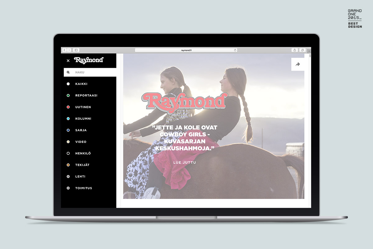
RAY (the Finnish Slot Machine Association) wanted to take it’s customer magazine online. The bar was set high: our goal was to produce an impressive, high quality online publication unlike anything else out there.
The fundamental question we dealt with was: how to retain Raymond’s “magazineness” and impressive visuality, while creating a digitally native service that works flawlessly on different devices.

A creative solution
We wanted Raymond’s user interface to be invisible, without any unnecessary trickery. A good user interface is unnoticeable to the user. It removes the need to think about use – and at best manages to surprise and delight.
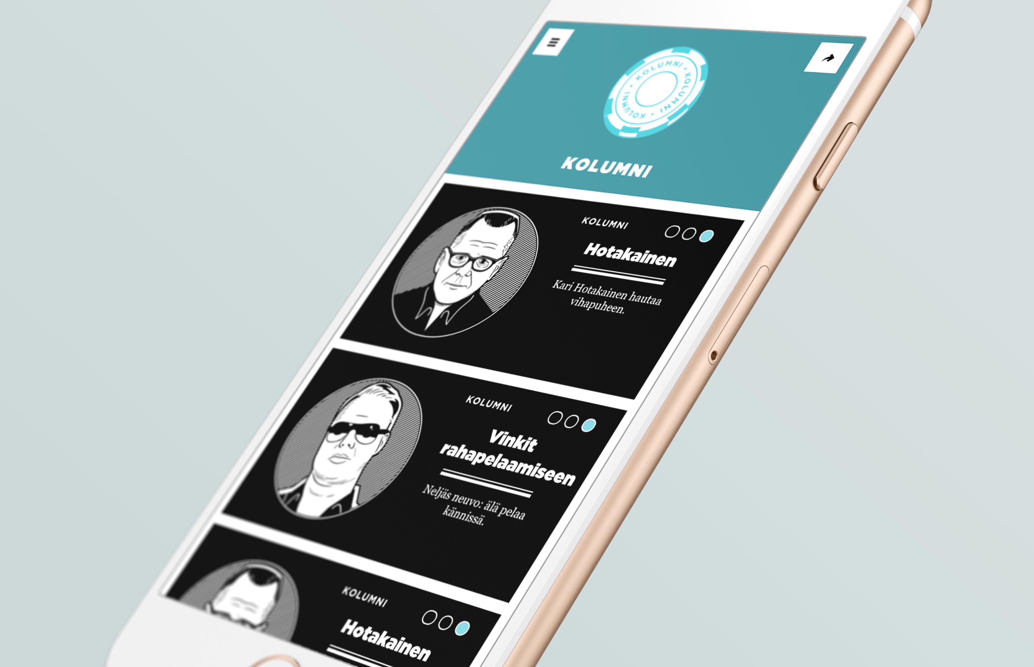
We thought about the different situations that digital Raymond would be consumed in. It was clear that the service should be designed and produced with a mobile and tablet devices first approach.
Raymod is full of beautiful photography and illustrations, so we didn’t want to compromise visuality. Raymond on the web is impressive, entertaining and doesn’t shy away from hard subjects and long form content.
We also wanted adapt the visually dynamic layout of the print magazine to the web. Let big stay big!

The overall concept
The design of digital Raymond is strategically fitted to the digital medium, utilizing it’s strengths. For instance, video content has a well defined visual identity while sound and typography are used creatively within the confines of the online medium.
The printed and digital versions of Raymond create a symbiosis where the shortcomings of one form of media are filled by the strengths of the other, extending the depth and lifetime of individual content pieces.
Implementation
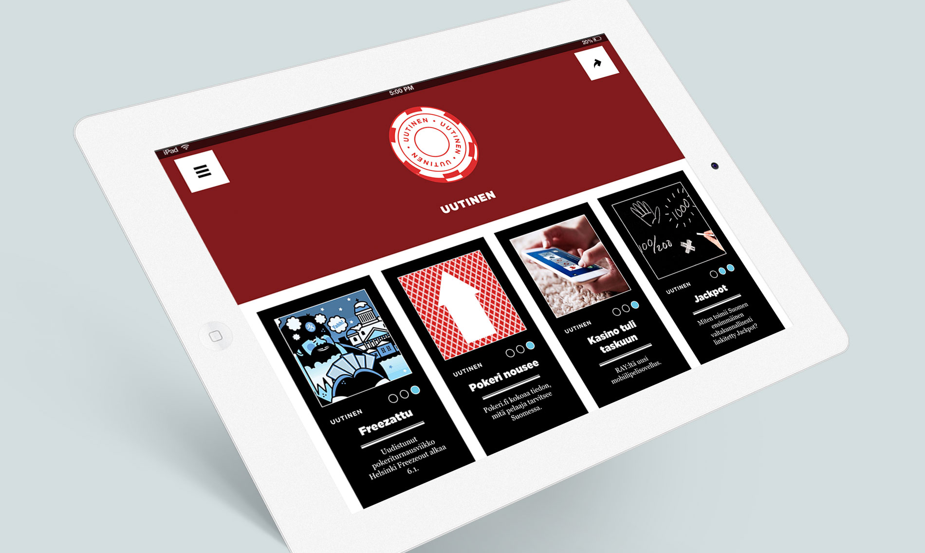
Much like the printed magazine, digital Raymond has a strictly defined visual identity where form and content support each other.
The user interface is a visually lush and impressive flow of content that abides to a strict grid and typographic rules. The content grid is automated in a way where articles and ads always fill the entire visible area in a way that is optimised based on the viewport size. Users can read or view articles and videos straight in the content stream, removing the need to navigate to an other page.
The best possible image quality is ensured by optimizing each photo for high resolution displays and by using vector illustrations.
Digital Raymond is built on WordPress which allows fast and flexible development and offers a user friendly administrative interface.

Special details
In addition to an invisible and robust user interface, we designed and implemented a handful of features that support new, online-native content concepts.
One example of these concepts is “the flipside of the coin”, where by flipping a digital coin, the user can visibly switch between two view points of a subject.
An other UI concept “the red line”, allows articles to be deepened and and enriched with annotations which appear at the side of an article – without forcefully distracting the flow of reading.
In terms of social media and community we ended up with a clear divide; content is published on the site while discussion relating to that content is free to take place on social media channels like Facebook and Twitter.
Results
Raymond was launched on 10.10.2014. In three months it gathered around 85.000 unique visitors and 250.000 page loads.
To this date the service has organically gathered over 13.700 likes, putting Raymond above long established Finnish publications like Suomen Kuvalehti and Image magazine.
Critical acclaim
In early 2015 Raymond.fi won “Best Design” in the annual Grand One competition.
Raymond also won “Digital solution of the year” in the annual Edit competiton for Finnish magazines, along with the title of “Best magazine article” for “The Strip” which makes excellent use of “the flip side of the coin” -concept.
Raymond also received two honorable mentions in the 2015 Webby awards, one for “Best Visual Design” and one for “Best use of photography”, respectively.
